
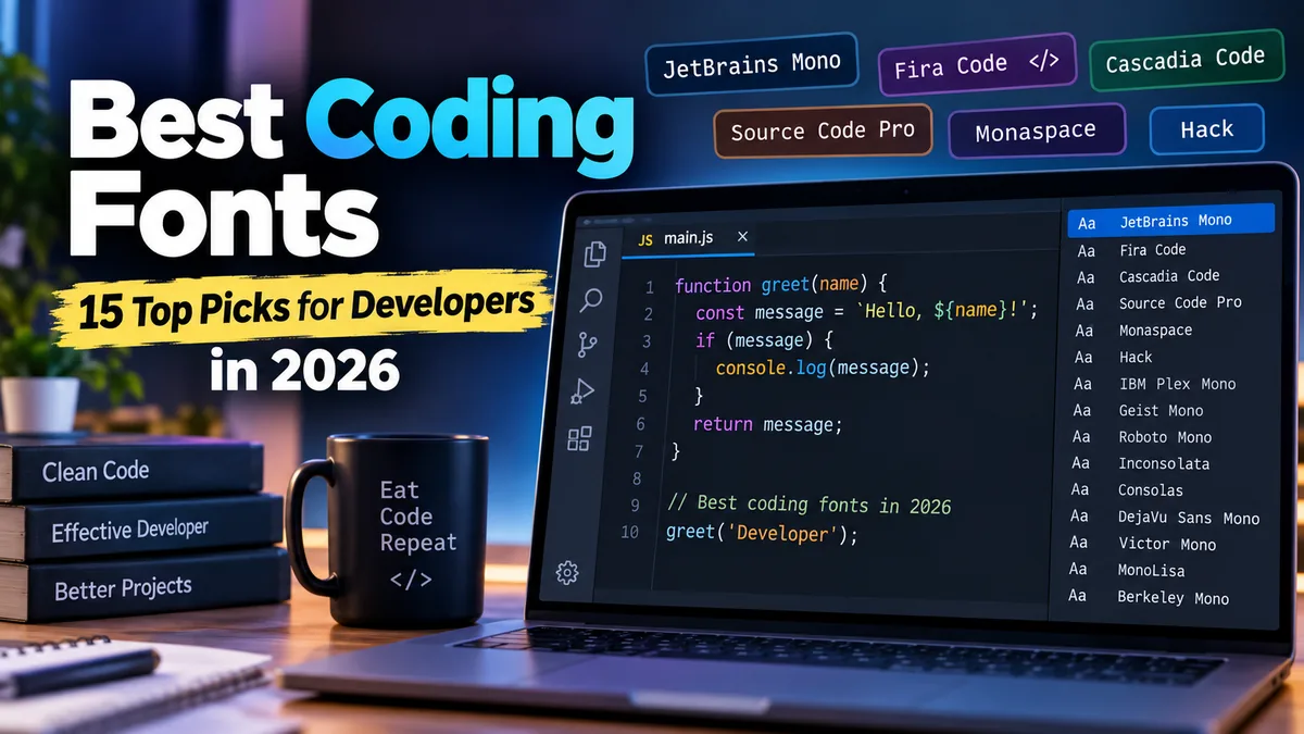

A coding font can look like a tiny part of your development setup until you spend several hours reading dense functions, debugging logs, or comparing nearly identical variable names. At that point, clear character shapes and comfortable spacing matter far more than visual novelty.
The best coding fonts in 2026 include JetBrains Mono, Fira Code, Cascadia Code, Source Code Pro, Monaspace, Hack, IBM Plex Mono, and Geist Mono. JetBrains Mono is an excellent all-round choice, Fira Code stands out for programming ligatures, while Source Code Pro suits developers who prefer clean, literal character rendering. Impex Infotech
What Makes a Good Coding Font?
Programming fonts have a different job from fonts used in articles, presentations, or branding.
Most developers want a monospaced typeface, meaning every character occupies the same horizontal width. This keeps indentation, tables, code blocks, terminal output, and columns visually aligned. Made Good Designs
But monospacing alone does not make a font good for programming.
A strong coding font should provide:
- Clear distinction between
0andO - Clear distinction between
1, lowercasel, uppercaseI, and| - Comfortable spacing
- Good readability at small sizes
- A useful range of font weights
- Strong punctuation and symbol visibility
- Reliable rendering in editors and terminals
- Sufficient Unicode coverage for your work
- Optional programming ligatures, if you like them
- Clear italic styles for comments and syntax highlighting
Character disambiguation is especially important. When identifiers contain combinations such as O0, Il1, or similar-looking punctuation, distinctive glyphs reduce the amount of visual checking required. This concern appears consistently across current coding-font comparisons. Ordoh
Best Coding Fonts Compared
| Font | Best For | Ligatures | Cost |
|---|---|---|---|
| JetBrains Mono | Best overall | Yes | Free |
| Fira Code | Programming ligatures | Yes | Free |
| Cascadia Code | Windows and terminals | Yes | Free |
| Source Code Pro | Clean, traditional coding | No | Free |
| Monaspace | Modern customization | Yes | Free |
| Hack | Terminals and small text | No | Free |
| IBM Plex Mono | Professional, neutral style | No | Free |
| Geist Mono | Modern minimalist setups | No | Free |
| Roboto Mono | General-purpose coding | No | Free |
| Inconsolata | Lightweight traditional look | No | Free |
| Consolas | Windows developers | No | System font |
| DejaVu Sans Mono | Unicode-heavy/Linux setups | No | Free |
| Victor Mono | Distinctive italics | Yes | Free |
| MonoLisa | Premium development setup | Yes | Paid |
| Berkeley Mono | Premium technical aesthetic | No | Paid |
There is no universally perfect choice. Your monitor, editor, operating system, preferred font size, programming language, and opinion on ligatures can change which font feels best.
1. JetBrains Mono — Best Coding Font Overall
For most developers looking for one font to try first, JetBrains Mono is an easy recommendation.
JetBrains created the typeface specifically with developers in mind. Its relatively tall x-height makes lowercase characters easier to identify at smaller sizes, while its character designs emphasize distinctions that matter when reading source code.
Current comparisons repeatedly place JetBrains Mono among the strongest overall programming fonts. Impex Infotech
Why JetBrains Mono works well
The font combines:
- Programming ligatures
- Multiple weights
- Italics
- Distinctive characters
- Generous readability
- Cross-platform usefulness
Its ligatures are optional, so developers who want literal operators can disable them.
The relatively large lowercase forms are particularly useful when you keep several editor panes open and need to use smaller text without sacrificing too much clarity.
Best for: Developers who want a balanced, modern font without spending much time experimenting.
2. Fira Code — Best for Programming Ligatures
Fira Code helped make programming ligatures mainstream.
Instead of changing the actual source code, ligatures change how certain sequences are displayed. For example, an operator composed of multiple characters can be visually represented as a unified symbol while the underlying text remains unchanged.
That distinction matters: ligatures affect presentation, not program behavior.
Fira Code is frequently recommended when ligature support is a priority. Nexter
Why developers like Fira Code
It offers:
- Extensive programming ligatures
- Good character distinction
- Multiple weights
- Free, open-source availability
- Broad editor compatibility
- A familiar monospace appearance
It works particularly well in editors such as Visual Studio Code when font ligatures are enabled.
The downside is simply preference. Some programmers find ligatures elegant and faster to parse, while others would rather see every operator exactly as typed.
Best for: Developers who actively want programming ligatures.
3. Cascadia Code — Best for Windows and Terminal Users
Cascadia Code comes from Microsoft and has become a natural option for developers working heavily within the Windows ecosystem.
It was developed alongside Windows Terminal and combines modern proportions with programming-oriented features. Current comparisons consistently recommend it for Windows Terminal and related development environments. urdu fonts
One useful distinction is between Cascadia Code, which includes programming ligatures, and Cascadia Mono, which provides a more literal monospaced presentation.
That gives you flexibility without requiring an entirely different font family.
Best for: Windows Terminal, PowerShell, Visual Studio, VS Code, and Windows-focused development environments.
4. Source Code Pro — Best Without Ligatures
Not everyone wants operators transformed into typographic symbols.
If you prefer seeing source code literally, Source Code Pro remains one of the strongest choices.
Designed by Paul D. Hunt for Adobe, Source Code Pro provides a neutral appearance that rarely distracts from the code itself. It also offers a broad range of weights. FontFYI
Its biggest advantage is restraint.
There are no programming ligatures competing for attention, and character differentiation remains strong.
This makes Source Code Pro particularly useful for developers who switch frequently among editors, code reviews, documentation, and terminals and want their typography to remain predictable.
Best for: Developers who dislike ligatures and want a clean, established programming typeface.
5. Monaspace — Best Modern Font Family
Monaspace takes a more ambitious approach than a conventional single coding font.
Created by GitHub Next, it is a superfamily designed for modern development environments. Instead of forcing every developer into one visual personality, the family provides multiple styles.
Monaspace also explores newer typography techniques intended to improve the visual texture of monospaced text. Current 2026 comparisons increasingly include it among the notable newer options for developers. Dev Resources
That makes it especially appealing if you enjoy customizing your editor rather than simply choosing a traditional monospace face.
Best for: Developers who want modern typography and more customization possibilities.
6. Hack — Best for Terminals
Hack is deliberately practical.
It was designed for source code and performs particularly well when text must remain recognizable at relatively small sizes.
That makes it a strong choice for:
- Terminal sessions
- SSH
- Linux development
- Logs
- Infrastructure work
- Compact editor layouts
It does not depend on decorative features to stand out. Instead, it focuses on legibility and recognizable glyph shapes.
Hack remains a frequent recommendation for terminal-oriented workflows. urdu fonts
Best for: Developers who spend significant time in terminal windows.
7. IBM Plex Mono — Best Professional-Looking Font
IBM Plex Mono brings the personality of the larger IBM Plex type system into a fixed-width font.
It feels slightly more editorial and designed than some purely utilitarian programming fonts, while remaining restrained enough for everyday coding.
That makes it useful if you want the same general visual language across:
- Source code
- Documentation
- Technical presentations
- Interfaces
- Design systems
IBM Plex Mono is also a good option for developers who want to avoid programming ligatures.
Best for: Professional environments where code and documentation need a consistent visual identity.
8. Geist Mono — Best Minimal Modern Option
Geist Mono is a newer choice associated with Vercel’s Geist family.
Its clean, contemporary appearance makes it particularly attractive to web developers who prefer minimalist development environments.
It provides multiple weights and a modern variable-font implementation, while avoiding the visually elaborate ligature-heavy approach of some alternatives. Made Good Designs
Geist Mono can pair naturally with a modern interface theme, especially when your editor setup already favors restrained UI typography.
Best for: Web developers and designers who prefer a contemporary minimalist look.
9. Roboto Mono — Best Familiar All-Purpose Choice
Roboto Mono adapts the broader Roboto design language to a monospaced environment.
The result feels familiar without looking like a traditional typewriter font.
It is useful when your work moves between:
- Programming
- Technical documentation
- Data
- UI prototypes
- Code examples
It lacks built-in programming ligatures, which can actually be an advantage for developers who want predictable character rendering.
Roboto Mono also offers multiple weights and italics. FontFYI
Best for: Developers who want a versatile font rather than a heavily stylized programming typeface.
10. Inconsolata — Best Traditional Alternative
Inconsolata has been around long enough to feel familiar to many programmers.
Its design has more personality than some modern geometric coding fonts while retaining the fixed-width structure necessary for source code.
One particularly interesting feature of modern Inconsolata builds is variable width support alongside variable weight, giving typography enthusiasts more control than they receive from many traditional coding fonts. FontFYI
It may not appeal to developers who prefer the larger x-height and heavier construction of JetBrains Mono, but it remains worth testing.
Best for: Developers who like a lighter, traditional monospace appearance.
11. Consolas — Best Built-In Windows Option
Sometimes installing another font is unnecessary.
Consolas has been a familiar Windows programming font for years and remains perfectly usable for development.
Its character designs were optimized for screen display, and the font distinguishes potentially confusing characters reasonably well.
The biggest benefit is convenience. Windows developers may already have it available without downloading or configuring another font package.
Newer choices such as JetBrains Mono and Cascadia Code may feel more modern, but Consolas remains a dependable baseline.
Best for: Windows users who want a familiar font that requires little setup.
12. DejaVu Sans Mono — Best for Broad Character Coverage
DejaVu Sans Mono is particularly useful in Linux environments and workflows involving a broad variety of symbols.
Its extensive character coverage can make it practical for:
- Linux terminals
- Scientific programming
- Mathematical notation
- Multilingual text
- Box-drawing characters
- Scripts containing unusual symbols
Current comparisons also highlight its usefulness where broad Unicode support matters. Nexter
Visually, it is less fashionable than newer coding fonts, but reliability can be more valuable than novelty.
Best for: Linux and Unicode-heavy development.
13. Victor Mono — Best for Distinctive Italics
Victor Mono is recognizable because of its expressive italic forms.
That characteristic becomes especially noticeable in editors where comments, annotations, or certain syntax categories are displayed in italics.
It also supports programming ligatures.
The styling will not suit everyone. If your goal is an invisible font that disappears behind the code, Source Code Pro may be more appropriate.
If you enjoy giving comments and syntax highlighting more personality, Victor Mono deserves a test.
Best for: Developers who want distinctive italics and visual character.
14. MonoLisa — Best Premium Coding Font
Most excellent programming fonts are free, so paying for one requires a good reason.
MonoLisa targets developers who care enough about typography to pay for additional refinement and extensive programming-focused features.
It offers numerous weights, italics, variable-font support, and extensive ligature options in its commercial packages. Current comparisons consistently position it among the leading premium coding choices. Made Good Designs
Is it necessary?
No. JetBrains Mono, Fira Code, Cascadia Code, Hack, and Source Code Pro already cover most developer needs without a purchase.
But someone who reads code for many hours every working day may reasonably treat typography as part of their professional tooling.
Best for: Developers who want a premium typeface and are willing to pay for typography.
15. Berkeley Mono — Best Premium Technical Style
Berkeley Mono takes a different premium approach.
Its appeal comes from a deliberately technical, engineered aesthetic rather than an enormous collection of visual programming tricks.
It is particularly attractive to developers who appreciate classic computing typography but want something more polished than an old terminal font.
The tradeoff is straightforward: it costs money in a category filled with exceptional free alternatives.
For many developers, that makes it unnecessary. For typography enthusiasts, its distinctive character may justify the expense.
Best for: Developers seeking a premium, technical-looking coding environment.
Best Coding Fonts for VS Code
Visual Studio Code supports custom fonts easily, so there is no single typeface you need to use.
A strong shortlist is:
- JetBrains Mono — best balanced choice
- Fira Code — best for ligatures
- Cascadia Code — excellent Windows option
- Source Code Pro — best clean no-ligature option
- Monaspace — strong modern alternative
- Geist Mono — good minimalist choice
JetBrains Mono is the safest starting point if you have no strong preference.
If you specifically want operators such as =>, !=, and related sequences displayed using programming ligatures, try Fira Code or Cascadia Code.
If that transformation bothers you, Source Code Pro is an excellent alternative.
Best Coding Fonts for JetBrains IDEs
For IntelliJ IDEA, PyCharm, WebStorm, PhpStorm, GoLand, Rider, and other JetBrains environments, JetBrains Mono is the obvious place to start.
The font was designed by JetBrains specifically around developer readability and fits naturally into the company’s IDE ecosystem. Ordoh
That does not mean you are required to use it.
Fira Code, Source Code Pro, Hack, and IBM Plex Mono can all work well. The important part is testing your choice with the languages and UI scale you actually use.
Best Coding Fonts for Terminals
Terminal typography has slightly different requirements from editor typography.
You may encounter:
- Dense logs
- Small font sizes
- Box-drawing symbols
- Powerline glyphs
- Remote SSH sessions
- Long command output
- TUI applications
For those situations, consider:
Hack for straightforward terminal readability.
Cascadia Code or Cascadia Mono for Windows Terminal.
JetBrains Mono for a modern cross-platform option.
DejaVu Sans Mono where broad character coverage matters.
If you use patched icon sets such as Nerd Fonts, verify that the specific patched version contains the symbols required by your shell prompt and terminal tools.
Programming Ligatures: Are They Better?
Programming ligatures combine the visual presentation of certain character sequences without modifying the underlying source code.
For example, a multi-character operator may appear as a more unified typographic symbol.
Fonts such as Fira Code, JetBrains Mono, and Cascadia Code support programming ligatures, while fonts such as Source Code Pro generally keep the original characters visually separate. Made Good Designs
Advantages of ligatures
They can:
- Make operators easier to recognize
- Reduce visual clutter
- Give code a polished appearance
- Help some developers scan expressions faster
Disadvantages of ligatures
They can also:
- Hide the visual boundaries between characters
- Confuse beginners
- Look different during screen sharing
- Make some debugging situations less intuitive
- Create inconsistent experiences between editors and terminals
There is no evidence-based reason that every programmer needs ligatures.
Try both modes for several days. If you start noticing the ligatures rather than the code, turn them off.
How to Choose the Best Coding Font for Your Eyes
Do not choose a font based entirely on screenshots.
A font that looks beautiful at 28 pixels on a showcase page may become uncomfortable at the 12–14 pixel range often used in an editor. Current coding-font guides consistently emphasize testing character distinction and readability at the size you actually use. Design Web Magic
1. Run the 0O1lI test
Open your editor and type:
0 O o 1 l I |
You should be able to identify each character immediately.
Then try realistic identifiers:
userId1
userID1
value0
valueO
If you repeatedly need to inspect a character closely, choose another font.
2. Test punctuation
Programmers spend far more time looking at punctuation than ordinary readers.
Check:
{} [] () <>
.,:;
'"
+-=*/
_ - ~
=> != === <= >=
Braces, commas, periods, colons, underscores, and operators should remain recognizable at your normal editor size.
3. Check lowercase readability
Look at words containing:
m n r i l t f
Fonts that become cramped can make dense variable names harder to scan.
A generous x-height often improves lowercase readability at small sizes, which is one reason JetBrains Mono performs well in many developer comparisons. Made Good Designs
4. Test your actual programming language
A JavaScript developer may care heavily about braces and arrow functions.
A Python developer may focus more on indentation, underscores, colons, and long identifiers.
A systems programmer may frequently read hexadecimal values.
A DevOps engineer may spend more time inside YAML files and terminals than conventional source-code editors.
Your own code is therefore a much better font test than generic sample text.
Font Size and Line Height Matter Too
Switching fonts cannot fix every readability problem.
A great typeface displayed too small or packed into excessively tight lines can still become tiring.
Instead of endlessly changing fonts, experiment with three settings together:
Font family: Start with a highly readable monospace font.
Font size: Make text large enough that you are not leaning toward the monitor or squinting.
Line height: Add enough vertical space that your eyes can move reliably from one line to the next.
The correct values depend on screen size, resolution, viewing distance, and eyesight.
For that reason, copying another developer’s exact font-size configuration is less useful than adjusting it on your own monitor.
Do Coding Fonts Reduce Eye Strain?
A more readable font can improve visual comfort, but no font should be treated as a medical solution for eye strain.
Clearer character forms, sufficient x-height, comfortable spacing, and an appropriate font size can make source code easier to read. Current comparisons of developer fonts frequently emphasize those characteristics when discussing long coding sessions. keys.skin
But your overall setup also matters.
Screen brightness, glare, contrast, viewing distance, text size, line spacing, and how long you work without changing focus can all affect comfort.
So instead of searching for a magical “eye-strain font,” build a comfortable editor configuration as a whole.
Free vs. Paid Coding Fonts
You do not need to buy a font to get excellent programming typography.
Free options such as:
- JetBrains Mono
- Fira Code
- Cascadia Code
- Source Code Pro
- Hack
- IBM Plex Mono
- Roboto Mono
- Inconsolata
- Geist Mono
- Monaspace
are strong enough for professional development.
Paid fonts become worthwhile primarily when you prefer their specific visual design or typography enough to justify the license.
A paid coding font does not inherently make you a faster or better programmer.
Which Coding Font Is Best for Beginners?
Beginners should prioritize clarity over style.
That means choosing a font where operators and similar characters remain obvious.
JetBrains Mono is a strong starting point because it combines modern styling with excellent readability.
Source Code Pro is another particularly good beginner option because its straightforward presentation does not depend on programming ligatures.
Beginners learning syntax may even benefit from disabling ligatures initially. Seeing !=, =>, and similar sequences exactly as typed makes the relationship between the source characters and the language syntax explicit.
Ligatures can always be enabled later.
Which Font Is Best for Long Coding Sessions?
JetBrains Mono, Hack, Source Code Pro, Fira Code, and IBM Plex Mono are all worth testing for extended work.
However, the answer depends heavily on personal perception.
One developer may prefer the taller x-height of JetBrains Mono, while another finds Source Code Pro calmer. Someone using a small terminal may prefer Hack, while a developer on a high-resolution display may enjoy a lighter typeface.
The practical test is simple: use each candidate for an actual workday rather than judging it from a specimen page.
Best Coding Fonts by Use Case
If you want a quick decision, use this shortlist:
| Need | Recommended Font |
|---|---|
| Best overall | JetBrains Mono |
| Best ligatures | Fira Code |
| Best Windows option | Cascadia Code |
| Best without ligatures | Source Code Pro |
| Best terminal font | Hack |
| Best modern family | Monaspace |
| Best minimalist style | Geist Mono |
| Best professional style | IBM Plex Mono |
| Best broad character coverage | DejaVu Sans Mono |
| Best distinctive italics | Victor Mono |
| Best premium option | MonoLisa |
| Best premium technical style | Berkeley Mono |
These categories should be treated as starting points rather than absolute rankings.
Common Coding Font Mistakes
Choosing appearance over readability
A distinctive font can look impressive in screenshots while becoming distracting after several hours.
Code is working text. Readability should come first.
Using text that is too small
More code on the screen does not automatically mean higher productivity.
If you need extra effort to identify characters, the additional visible lines provide little benefit.
Ignoring punctuation
Alphabet samples are poor tests for programming fonts.
Always examine braces, parentheses, commas, periods, underscores, pipes, quotes, and operators.
Assuming ligatures are automatically better
Ligatures are a preference, not a requirement.
Try them. Keep them if they help. Disable them if they make source code harder to interpret.
Copying someone else’s editor configuration exactly
A font setup that looks great on a 4K monitor may render differently on a lower-resolution laptop.
Operating-system rendering can matter too.
Test everything on the hardware you actually use.
Final Verdict on the Best Coding Fonts
The best coding fonts are the ones that make source code easy to read without drawing attention to themselves.
For most developers, JetBrains Mono is the strongest place to start because it balances character clarity, a tall x-height, multiple weights, italics, and optional programming ligatures. Fira Code is an excellent alternative if ligatures are your priority, while Cascadia Code fits Windows-focused workflows particularly well. Impex Infotech
Choose Source Code Pro if you want clean typography without ligatures, Hack for terminal-heavy work, or Monaspace if you want to experiment with a more modern coding family.
Most importantly, test your final candidates using your own source code at your normal font size. Check 0/O, 1/l/I, punctuation, indentation, comments, and long identifiers. The font that remains clear and comfortable after several hours—not the one that looks best in a screenshot—is the right coding font for you.
