
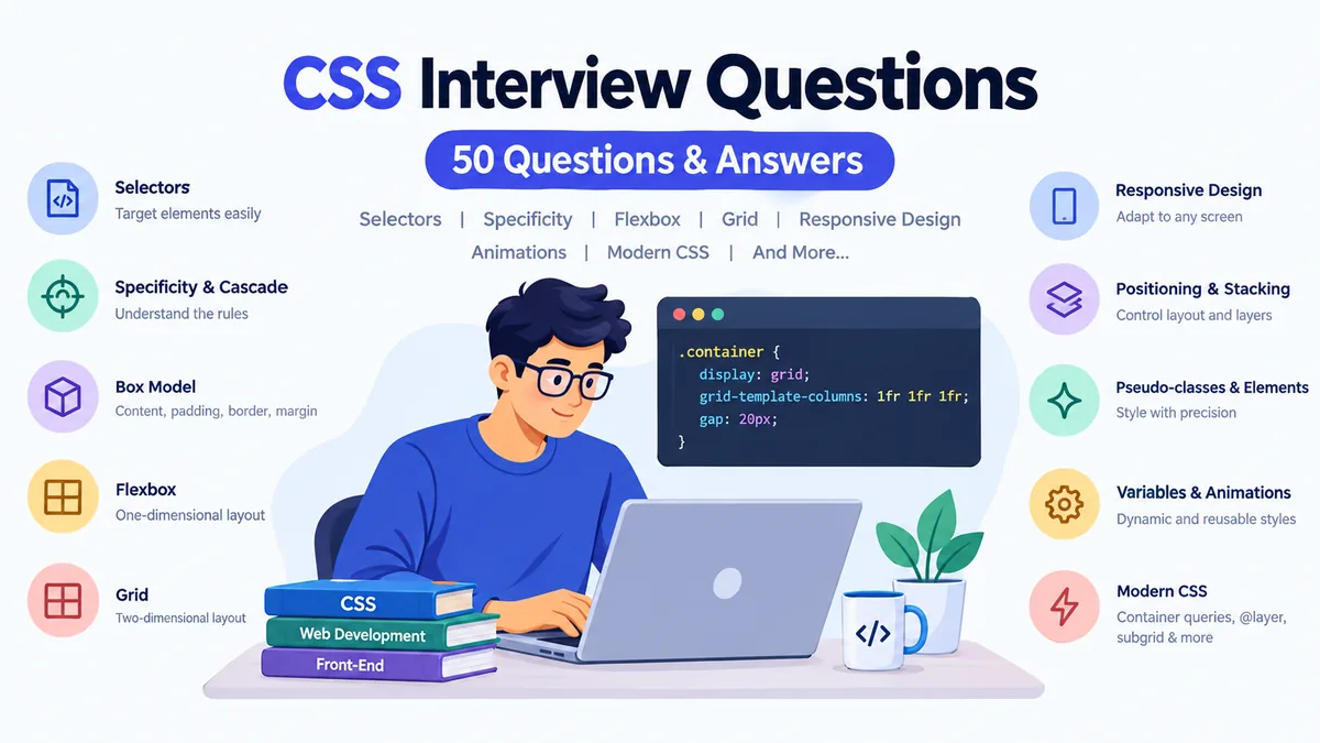

CSS can look deceptively simple in an interview. Writing color: blue is easy; explaining why a declaration loses in the cascade, why z-index appears broken, or when Grid is preferable to Flexbox requires a much deeper understanding.
These css interview questions cover the fundamentals and the practical concepts commonly tested in front-end interviews, including selectors, specificity, the box model, positioning, Flexbox, Grid, responsive design, animations, custom properties, container queries, cascade layers, and performance. Current interview-preparation resources consistently emphasize these areas rather than simple property memorization. Tarmac
Quick answer: CSS interviews generally test whether you understand how styles are selected, resolved, sized, positioned, and rendered. Expect questions about the cascade and specificity, the box model, Flexbox and Grid, responsive layouts, positioning and stacking contexts, pseudo-selectors, browser behavior, accessibility, and modern features such as container queries and cascade layers.
Basic CSS Interview Questions
1. What is CSS?
CSS stands for Cascading Style Sheets. It is the language used to control the presentation of HTML documents.
CSS handles visual properties such as:
- Colors
- Typography
- Spacing
- Borders
- Backgrounds
- Layout
- Responsive behavior
- Transitions and animations
HTML describes the content and structure, while CSS determines how that content is presented.
2. Why is CSS called “cascading”?
The word cascading refers to the process the browser uses to determine which declaration should apply when several CSS rules affect the same property.
The decision involves factors such as cascade origin, importance, cascade layers, specificity, scoping proximity where relevant, and source order.
This means the rule written last does not automatically win in every situation.
3. What are the ways to add CSS to HTML?
There are three common methods.
Inline CSS:
<p style="color: blue;">Hello</p>Internal CSS:
<style>
  p {
    color: blue;
  }
</style>
External CSS:
<link rel="stylesheet" href="styles.css">External stylesheets are normally preferred for maintainable multi-page applications because styles can be organized and reused.
4. What is a CSS rule?
A CSS rule consists primarily of a selector and a declaration block.
.card {
  padding: 20px;
  background: white;
}
Here, .card is the selector. padding and background are properties, while 20px and white are their respective values.
5. What are CSS selectors?
Selectors determine which elements a CSS rule targets.
Common selectors include:
* {}                 /* universal */
p {}                 /* type */
.card {}             /* class */
#header {}            /* ID */
input[type="text"] {} /* attribute */
nav a {}              /* descendant */
nav > a {}            /* child */
h2 + p {}             /* adjacent sibling */
h2 ~ p {}             /* general sibling */
Pseudo-classes and pseudo-elements extend the selector system further.
CSS Specificity, Cascade, and Inheritance Questions
Specificity and the cascade remain some of the most frequently tested CSS concepts because they reveal whether a candidate understands why a style is applied rather than merely knowing CSS syntax. Bugged Brains
6. What is CSS specificity?
Specificity is part of the cascade algorithm used to compare competing selectors within the relevant cascade origin and layer.
Consider:
p {
  color: blue;
}

.message {
  color: green;
}

#notice {
  color: red;
}
For an element matching all three selectors, the ID selector has greater specificity than the class and type selectors.
A useful conceptual hierarchy is:
ID selectors > class, attribute, and pseudo-class selectors > type and pseudo-element selectors
Inline styles also have special precedence within author styles, but treating specificity as a simple universal ranking misses other cascade factors.
7. What happens when two selectors have equal specificity?
If otherwise competing declarations have the same cascade precedence and specificity, later declarations generally win based on source order.
.title {
  color: blue;
}

.title {
  color: red;
}
The title becomes red.
8. What does !important do?
!important changes a declaration’s importance in the cascade.
.notice {
  color: red !important;
}
It can override ordinary declarations that would otherwise win. However, indiscriminate use makes CSS harder to maintain because future overrides become more difficult.
A good interview answer should explain both what it does and why routinely using it to fix specificity problems is usually undesirable.
9. What is inheritance in CSS?
Inheritance allows certain property values to pass from a parent element to its descendants.
Properties commonly inherited include:
color
font-family
font-size
line-height
Properties such as margin, padding, border, and width normally do not inherit automatically.
10. What is the difference between inherit, initial, unset, and revert?
inherit explicitly takes the computed value from the parent.
initial uses the property’s CSS-defined initial value.
unset behaves like inherit for naturally inherited properties and initial for non-inherited properties.
revert rolls the property back according to the cascade, potentially exposing a value from an earlier origin or layer rather than simply applying its initial value.
11. What are CSS cascade layers?
Cascade layers allow developers to explicitly control groups of styles using @layer.
@layer reset, components, utilities;They can be particularly useful in large applications where resets, third-party styles, components, and utilities need predictable precedence.
Modern interview guides increasingly include @layer alongside newer CSS features. Toolmingo
CSS Box Model Interview Questions
12. What is the CSS box model?
Every rendered CSS element can be considered a rectangular box consisting of:
Content → Padding → Border → Margin
For example:
.card {
  width: 300px;
  padding: 20px;
  border: 5px solid black;
  margin: 10px;
}
Understanding how these dimensions interact is essential for diagnosing layout problems.
13. What is the difference between content-box and border-box?
With the default:
box-sizing: content-box;the declared width represents only the content area. Padding and borders increase the element’s final outer size.
With:
box-sizing: border-box;the declared width includes the content, padding, and border.
A common reset is:
*,
*::before,
*::after {
  box-sizing: border-box;
}
This often makes component dimensions easier to reason about.
14. What is margin collapsing?
Certain vertical margins of block elements in normal flow can collapse rather than being added together.
For example, adjacent vertical margins of 30px and 20px may result in a 30px separation rather than 50px.
Margin collapsing has specific rules and does not apply universally. Flex and Grid items, for example, do not have collapsing margins in the same way normal block-flow children do.
15. What is a block formatting context?
A block formatting context, or BFC, is an independent layout environment affecting how block boxes and floats interact.
One clean way to create one intentionally is:
.container {
  display: flow-root;
}
BFC knowledge can help explain float containment and some margin behavior.
CSS Units and Sizing Questions
16. What is the difference between px, em, and rem?
px is a CSS pixel unit.
em is relative to a relevant font size; for font-size itself, it is based on the parent’s computed font size.
rem is relative to the root element’s font size.
For example:
html {
  font-size: 16px;
}

.title {
  font-size: 2rem;
}
The title’s computed font size would normally be 32 CSS pixels.
17. What are viewport units?
Traditional viewport units include:
vw— 1% of viewport widthvh— 1% of viewport heightvmin— 1% of the smaller dimensionvmax— 1% of the larger dimension
Modern CSS also provides viewport variants such as svh, lvh, and dvh, which are useful when browser interface elements change the available viewport on mobile devices.
18. What do min(), max(), and clamp() do?
These CSS functions enable flexible sizing without requiring numerous media queries.
For example:
h1 {
  font-size: clamp(2rem, 5vw, 4rem);
}
The value can scale fluidly while remaining between the defined minimum and maximum.
CSS Display and Positioning Interview Questions
19. What is the difference between block, inline, and inline-block?
A block element generally starts on a new line and participates as a block-level box.
An inline box flows within text and does not behave like a block with respect to width and height.
inline-block flows inline while allowing block-like sizing.
The precise behavior comes from CSS’s inner and outer display types, but this simplified explanation is usually sufficient for an initial interview answer.
20. What is the difference between display: none and visibility: hidden?
display: none;removes the element’s box from normal layout.
visibility: hidden;makes the element invisible while generally preserving its layout space.
That difference matters when surrounding content should or should not move.
21. Explain CSS position values.
static is the normal default positioning scheme.
relative keeps an element in normal flow while allowing offsets and can establish a containing block for positioned descendants.
absolute removes the element from normal flow and positions it relative to its containing block.
fixed is generally positioned relative to the viewport.
sticky behaves according to normal flow until a specified scrolling threshold is reached within its relevant scrolling context.
22. Why does position: sticky sometimes not work?
Common causes include:
- No inset such as
top: 0 - An unexpected scrolling ancestor
- Insufficient space for sticky movement
- Parent/container sizing constraints
- Overflow behavior on ancestors
Instead of immediately changing z-index, inspect the sticky element’s containing and scrolling contexts.
23. What is z-index?
z-index affects the stack level of positioned elements and certain other layout items.
A common interview trap is saying that the element with the highest numerical z-index always appears on top.
It does not.
Elements can belong to different stacking contexts, so a child with z-index: 9999 can still render beneath an element in another higher stacking context.
24. What creates a stacking context?
Examples include, under the appropriate conditions:
- The root element
- Positioned elements with a non-auto
z-index - Fixed or sticky positioned elements
- Elements with
opacitybelow 1 - Certain transforms
- Certain filters
- Isolation
- Some containment configurations
Understanding stacking contexts is usually more useful than simply increasing z-index.
Flexbox CSS Interview Questions
Flexbox and Grid appear repeatedly in modern CSS interview material, with interviewers commonly expecting candidates to explain not only syntax but also when each layout system is appropriate. EasyInterview
25. What is Flexbox?
Flexbox is a layout model designed primarily for distributing and aligning items along a main axis, with control over the cross axis as well.
Enable it with:
.container {
  display: flex;
}
It is especially convenient for navigation bars, controls, button groups, component alignment, and many content-driven layouts.
26. What are the main axis and cross axis?
The main axis follows flex-direction.
With:
flex-direction: row;the main axis is normally horizontal.
With:
flex-direction: column;it is normally vertical.
The cross axis is perpendicular to the main axis.
27. What is the difference between justify-content and align-items?
In Flexbox:
justify-content controls distribution along the main axis.
align-items controls alignment along the cross axis.
For example:
.container {
  display: flex;
  justify-content: center;
  align-items: center;
}
This is a common method of centering a child on both axes when the container has available space.
28. What do flex-grow, flex-shrink, and flex-basis mean?
flex-basis establishes an item’s initial main-size basis before free space is distributed.
flex-grow controls how positive free space is distributed.
flex-shrink controls how items shrink when there is insufficient space.
The shorthand:
flex: 1 1 200px;represents grow, shrink, and basis values.
29. What does flex-wrap do?
By default, flex items remain on one flex line.
.container {
  display: flex;
  flex-wrap: wrap;
}
allows items to move onto additional flex lines when needed.
CSS Grid Interview Questions
30. What is CSS Grid?
CSS Grid is a layout system designed around rows, columns, tracks, and grid lines.
.container {
  display: grid;
  grid-template-columns: 1fr 1fr 1fr;
}
It is particularly useful when relationships across both rows and columns matter.
31. What is the difference between Flexbox and Grid?
The standard interview answer is:
Flexbox is primarily one-dimensional; Grid is two-dimensional.
The more useful explanation is that Flexbox is often ideal when content distribution along an axis drives the layout, while Grid excels when you want elements aligned to shared rows and columns.
They are complementary rather than competing technologies. A page might use Grid for its overall structure and Flexbox inside individual components. EasyInterview
32. What does fr mean in CSS Grid?
fr represents a fraction of the available space in a grid container.
grid-template-columns: 1fr 2fr;The second flexible track receives twice the share of available space allocated to the first, subject to sizing constraints.
33. What does minmax() do?
minmax() defines a track-size range.
grid-template-columns:
  repeat(auto-fit, minmax(250px, 1fr));
This pattern is frequently used for responsive card layouts because columns can adapt to the available container width.
34. What is the difference between auto-fill and auto-fit?
Both can generate repeated tracks based on available space.
auto-fill can preserve empty generated tracks.
auto-fit collapses empty repeated tracks, allowing occupied tracks to expand into the available space.
The distinction becomes particularly visible when there are fewer grid items than available column slots.
35. What is subgrid?
subgrid allows a nested grid to use track sizing inherited from its parent grid along a chosen axis.
This can help align content across nested components without manually reproducing the parent’s track definitions.
Responsive CSS Interview Questions
36. What is responsive web design?
Responsive web design allows an interface to adapt to different viewport or container sizes and user environments.
Common techniques include:
- Flexible layouts
- Flexible media
- Relative units
- Flexbox
- Grid
- Media queries
- Container queries
min(),max(), andclamp()
Good responsive CSS generally avoids assuming a single fixed screen width.
37. What is a media query?
Media queries conditionally apply CSS based on characteristics of the output environment.
@media (max-width: 768px) {
  .sidebar {
    display: none;
  }
}
They can respond to much more than width, including user preferences such as reduced motion.
38. What does mobile-first CSS mean?
A mobile-first approach starts with styles appropriate for smaller layouts and progressively enhances the interface as more space becomes available.
For example:
.card {
  width: 100%;
}

@media (min-width: 768px) {
  .card {
    width: 50%;
  }
}
It is a strategy, not a requirement that every project must follow.
39. What are container queries?
Media queries generally respond to viewport or device characteristics. Container queries allow styles to respond to the dimensions or other supported features of an ancestor query container.
For example:
.card-wrapper {
  container-type: inline-size;
}

@container (min-width: 500px) {
  .card {
    display: grid;
    grid-template-columns: 1fr 2fr;
  }
}
This is valuable for reusable components that can appear in sidebars, dashboards, or full-width content areas.
Container queries now appear in contemporary CSS interview preparation alongside other modern features. Toolmingo
Pseudo-Classes, Pseudo-Elements, and Modern Selectors
40. What is the difference between a pseudo-class and a pseudo-element?
A pseudo-class selects an element based on a state or structural condition.
button:hover {}
input:focus {}
li:first-child {}
A pseudo-element targets a conceptual part of an element.
p::first-line {}
.card::before {}
.card::after {}
A simple interview explanation is: pseudo-classes describe states or relationships, while pseudo-elements represent parts or generated boxes associated with elements.
41. What are ::before and ::after?
They generate pseudo-elements before or after an element’s content.
.required::after {
  content: " *";
}
They are useful for decorative content, icons, overlays, and other presentation-oriented effects.
Essential information should not depend solely on generated CSS content.
42. What is :is()?
:is() groups selector alternatives into a more compact expression.
Instead of:
header a,
nav a,
footer a {
  color: blue;
}
you could write:
:is(header, nav, footer) a {
  color: blue;
}
Specificity rules still matter: the specificity contribution of :is() is based on its selector-list arguments.
43. What is :where()?
:where() works similarly to :is() for selector matching, but the :where() pseudo-class and its arguments contribute zero specificity.
:where(article, section) h2 {
  margin-top: 2rem;
}
That makes it particularly useful for easily overridden base styles.
44. What is :has()?
:has() is a relational pseudo-class that can select an element based on relative selectors matching from that element.
For example:
.card:has(img) {
  padding-top: 0;
}
It enables patterns that developers historically struggled to express with selectors alone.
CSS Variables, Animations, and Performance Questions
45. What are CSS custom properties?
Custom properties allow reusable values to be defined in CSS.
:root {
  --primary-color: #2563eb;
}

button {
  background: var(--primary-color);
}
Unlike preprocessor variables, custom properties participate in CSS’s cascade and can be changed dynamically by selectors, media queries, JavaScript, and inheritance.
46. What is the difference between transitions and animations?
A transition interpolates between property values when a change occurs.
button {
  transition: transform 0.2s ease;
}

button:hover {
  transform: scale(1.05);
}
Animations use keyframes to describe one or more stages:
@keyframes pulse {
  50% {
    transform: scale(1.05);
  }
}

.badge {
  animation: pulse 1s infinite;
}
Use transitions for relatively straightforward state changes and animations when more explicit timing or multiple stages are required.
47. What is the difference between reflow and repaint?
A layout or reflow occurs when the browser needs to recalculate geometry and positioning.
A repaint updates pixels when visual appearance changes without necessarily requiring layout recalculation.
Rendering behavior is more nuanced in modern browsers because compositing can move some work into separate stages. Still, understanding layout, paint, and compositing is useful when diagnosing performance problems.
48. What is will-change?
will-change gives the browser advance information that a property is expected to change.
.modal {
  will-change: transform;
}
It should not be applied indiscriminately. Browser optimizations can consume additional memory or resources, so it is better reserved for demonstrated performance needs.
49. What are CSS preprocessors?
CSS preprocessors such as Sass and Less provide authoring features that are transformed into regular CSS.
Historically important features include:
- Variables
- Nesting
- Mixins
- Functions
- Reusable modules
Native CSS now provides capabilities such as custom properties and nesting, reducing the need for preprocessors for some workflows, though preprocessors can still be useful in established tooling and codebases.
50. How should you answer practical css interview questions?
Do not stop at a memorized definition. Explain the mechanism and then give a practical example.
If an interviewer asks, “When would you use Grid instead of Flexbox?”, a stronger answer explains that Grid coordinates rows and columns, gives a real use case such as a dashboard, and then mentions that Flexbox can still be used inside individual grid items.
Likewise, if asked why z-index is not working, investigate stacking contexts instead of suggesting an arbitrarily larger number.
Current interview resources increasingly emphasize practical reasoning, debugging, and coding scenarios rather than property memorization alone. Tarmac
How to Prepare for CSS Interview Questions
Start with the fundamentals because advanced CSS problems frequently reduce to basic concepts.
Make sure you can explain the cascade and specificity without guessing. Build layouts with both Flexbox and Grid rather than memorizing their property names. Practice debugging overflowing containers, unexpected margins, sticky elements, and stacking-context problems.
Then review modern features such as clamp(), custom properties, logical properties, :is(), :where(), :has(), container queries, cascade layers, subgrid, and @scope. Recent CSS interview resources increasingly include these alongside traditional questions about selectors, box sizing, positioning, and responsive design. Toolmingo
Most importantly, practice explaining your reasoning aloud. Saying that Flexbox is “one-dimensional” may answer the definition, but explaining why you would choose it for a navigation bar and Grid for a coordinated dashboard demonstrates practical understanding.
Final Thoughts on CSS Interview Questions
The most useful way to prepare for css interview questions is to understand the browser’s layout and styling rules rather than memorize dozens of isolated definitions.
Master the cascade, specificity, inheritance, box model, positioning, stacking contexts, Flexbox, Grid, responsive design, and modern selectors first. Then practice building and debugging real components. When you can explain both what a CSS feature does and why you would choose it, you are much better prepared for the follow-up questions that turn a basic CSS interview into a practical front-end discussion.
